Thursday, February 28, 2019

Week Six of Genius Hour Two - CGI Bathroom of your Dreams

This week, I modeled a bathroom!  I will be cutting out a lot of the basic modeling stuff out of this blog post.  I don't want to spend hours explaining how I made a simple object, and I am sure you don't want to read about it either.  As such, some of the pictures won't really have any explanations.  I will probably just spend my time explaining the new stuff.  The blog will take just as long anyways.


I started with the tub first as it was a simple shape.


I decided to change the tub.  After that, I started on the mirror, counters, and a window.  In the left photo, you can see grass.  This is because I am using an HDR.  This is a file that the computer reads and projects onto the background.  Besides adding a realistic background, an HDR also provides realistic lighting.


After working on the bathroom for a few days, I realized this was the two-week period.  As such, I moved on the scene I was planning to do, a library.  I started with the bookshelves and moved on from there.  I was sort of going off of my memory of the public library.


However, I was not liking the result.  One reason was that I was having difficulties with the books.  So, after a couple days of work, I went back to the bathroom scene.  

While working on the library, I tried to import a procedural wood texture I had downloaded.  Procedural means that it is generated entirely from the computer and not an image.  This is useful as you can then change everything from color to grain.  I tried importing it using a method I read about before, but I actually did not hit the right keys, so I ended up writing over my bathroom scene.  I had to start all over.  At this point, it was practically going to be a one week period for me.


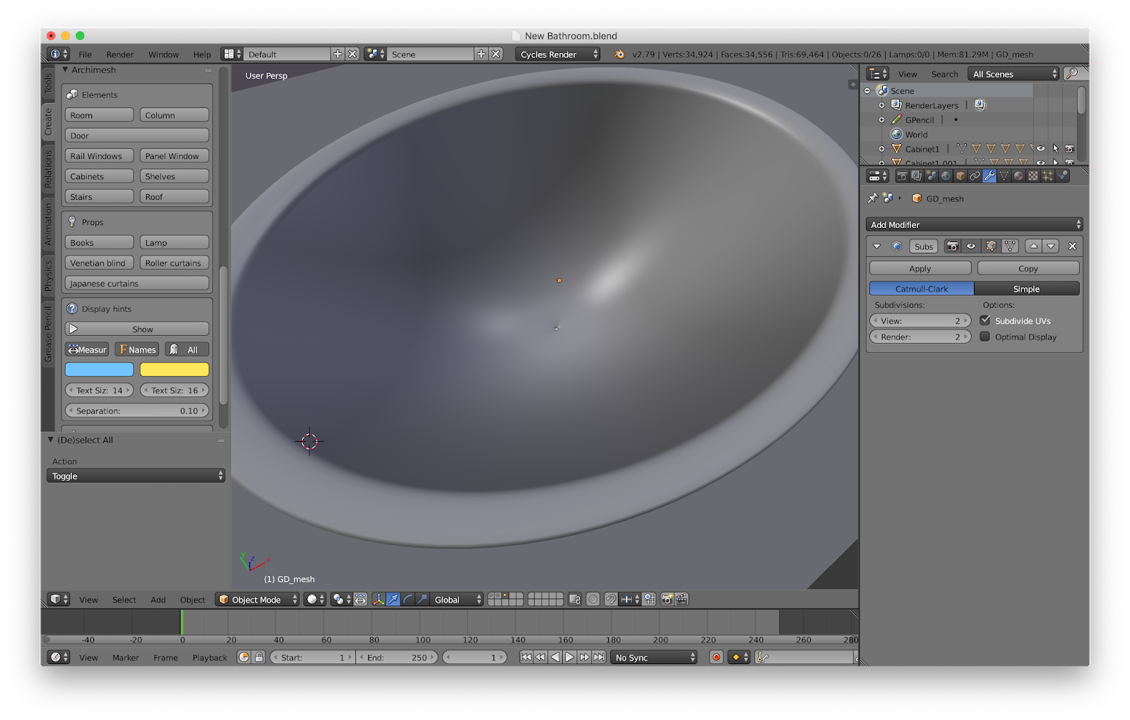
In an architecture video by Blender Guru, he mentioned the add-on called Archimesh.  This add-on and many others come with Blender but are turned off by default.  I turned it on and a few others to see what they can do.  Ultimately, they were a great time-saver and gave me a better result than I otherwise would have gotten.


One of the most used features of Archimesh is the ability to generate walls.  You can set the length of each wall, the number of walls, the angle of the wall, and even if it is curved or not!  Using the grease pencil, you can draw the room.  I probably won't be using the grease pencil too much, but it has some other uses.  One of its uses is for 2D animation.


There is also a column, cabinet, and window generator.  You can easily change the type and size.  These are a great time saver, and they even come in default materials.


Oh, look.  It's a book generator.  It randomizes width, height, depth, slant, and color.  This would have been useful to have.


There was also another really useful add-on I turned on.  It was called the material library, and it has a large set of procedural materials.  Thankfully, it saved me from downloading image textures or messing around with nodes on my own.  I mentioned before how procedural textures are better than image texture as you can easily change things.  For example, the tiles I used came in the colors on the right, but I didn't want that.  Because it was a procedural texture, I was able to change a few colors to get the result I wanted.  The material also came with normals and displacement, meaning that it doesn't look like a flat picture.  The left image shows how the light reacts to the floor.  I later changed the tiles to black and resized them.


I used the aforementioned cabinet generator to get the cabinet on the left.  For the sink, I added a parabola, which was a shape in one of the add-ons.  I did some resizing and extrusion to get the result I wanted.  Unfortunately, I don't have any photos of the rest of the sink modeling, but it was simple stuff.  I added a shape into the sink so the facet would have a place to sit on.  The facet and the handles were just done using extrusion, though I did use the spin tool on the facet.


Eventually, a door was slapped in along with a window.  The walls have an auto-hole feature.  You click a button, and the windows and doors carve out a hole in the wall so the wall doesn't clip through them.


I decided to add a trash can.  I felt it needed a bag, but I just trashed it as the can doesn't even show up in the final render.


I've been keeping the sink on a different render layer from the rest of the scene.  This allows me to easily turn the sink on and off or select it if I need to move it.  The sink is made of a dozen or so parts, so selecting them all could be difficult.  Putting it on its own layer makes it easy to work on it.  I put many other objects in the scene on different layers besides the sink.  The orange dot means that an object on that layer is selected, and the dark gray box means that specific layer is currently being viewed.  If I was making an animation, it may be useful to keep the characters on a different layer so they aren't in the way of the scene, or vice versa.


I felt that there was too much space in between the tub and sink so I slapped in another wall.  I also added a wall on the side of the tub for a shower to go in.


It can't be seen, but an image texture was added to the ceiling to make it look like an actual ceiling.


This was the hard part.  I wanted tiles around the tub, much there wasn't an appropriate procedural material.  I could have fiddled around with the floor tiles, but I decided just to use an image texture.  Where the ceiling was a flat plan, this was a less flat plane.  As such, I needed to UV unwrap it.  I manage to figure this out on my own, but I should have marked the seems for unwrapping.  The computer did what it wanted, so the tiles were rotated in the wrong direction.


I was having an issue with the normal map.  It wasn't scaled properly, so it was causing all of these little ghost brinks.  I don't know if the image is clear enough to see them, though.


I resized the plane and ended up having to unwrap all over again.  In the left image, I tried to get the seems to line up and to get the scale correct.  Although all the images were the correct scale in relation to each other, I wanted to scale them some more so there would be more bricks.  I couldn't do it, unfortunately.


Here is the shower.  I used the pool water material for the glass.  It gave me the effect I wanted; I just had to change the color.  The handle was stolen from a door.


I was scared to do the floor mat, but something was needed to fill that void.  Thankfully, there was a crushed velvet material in the library.  I changed the color and whatever input was responsible for the rough look.  I eventually got a mat that looked like it belonged in my own bathroom.  There even appears to be a little rim on the edges, though this is likely just the subsurface modifier messing with the material.


In the mirror, you could see the back wall, and it was looking bare.  Using the same material as above, I made a simple towel.  This material is not perfect, but it worked great for what I needed.  Otherwise, I would have had to use a particle system.  I did do one of those on my donut, but I wasn't having much luck with the towel.


To fill space and make the bathroom feel more like a bathroom, I added some objects.  I am not going to talk about them, but I wanted to use one to demonstrate a problem I have noticed.  There is smooth and flat shading in Blender.  Smooth shading tries to shade the mesh in such a way that you can't tell it is low-poly.  However, it often leaves weird looking spots, as seen in the left image.  Because of this, I often find it easier to jack up the subsurface modifier.  That, unfortunately, increases render times.  Creases and edge loops are supposed to tell the smooth shading how to work, but it doesn't really seem to help.  You can, though, choose which faces have smooth shading and which have flat shading while in edit mode.  I did that for the bathtub and made the inside smooth shaded.


Blender Guru also said that architecture renders need something to draw the eye, so I added a vase of my roses.  To get them to fit, I had to distort some stalks.


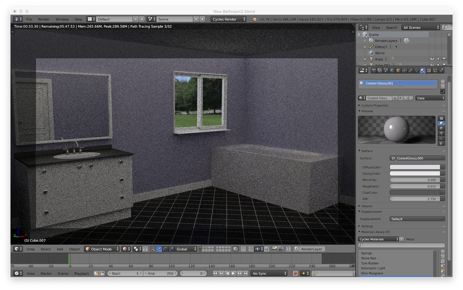
Here is an outside view of the room.  There are a couple of objects I just left because they wouldn't be seen.  The outside doesn't match the inside, and this is because I added separate walls to change the dimensions instead of changing the original walls.


One of the problems I had with this scene was lighting.  I didn't want everything to be illuminated because it would look fake, but I needed some light in the room because the HDR was not enough.  I added a light outside of the room, but it showed up as a bright, white barrier unless I set it to portal.  You are supposed to set lights outside of a window to portal to prevent noise and save on render times.  I wanted some light to be entering the window to set a bit of a mood, so I eventually set a light up to do this.

Also, notice all the noise.  I turned off the denoiser because the denoiser was causing weird swirls in the practice renders.  I decided about an hour into the six-hour render that I was going to have to rerender it to get rid of the noise.  I do not know if that is noise to be exact.  There are things called fireflies that can appear due to lighting, and those are much harder to remove.

Even if there was no noise, I would still have to rerender.  Notice the towel rack.  I rotated the entire scene so the image outside the window would be different, but the rack didn't rotate, so it clipped through the wall and towel.  This rack would not rotate through normal means.  I had to rotate it through the properties panel and not through the 3D view.  It also didn't finish rendering, hence the missing square.


And here is the final image!  I took a few hours and tweaked a bunch of stuff.  For example, the lighting is a bit different, and I got that warm afternoon lighting I was going after.  My later renders should look better as I downloaded and installed a new lighting system.  It is supposed to give a more realistic look to your scenes by changing how the light reacts.  I also changed the labels on the bottles on the tub.  Originally, they were just text, but I got some actual labels to make it more realistic.  These images were added to a plane.  That plane then had a bunch of loop cuts added to it to increase its geometry.  Finally, I used the shrink-wrap modifier to fit them to the bottle.

Ultimately, I do like how this scene turned out.  As I practice more with architecture renders, they will probably start looking better and become more realistic looking.  This is something I wanted to try as CGI is used a lot for retail and real estate.  Google "bathroom."  Most of the results are CGI.  It is simply much easier to have someone model the scene with a computer instead of setting the entire thing up in the real world.  Some of the stuff in this scene was done using add-ons.  In the real world, most modelers would have access to a large library of models and materials, so they would only need to model the room and maybe a few other components.

On a side note, I finally watched that episode of Tigtone.  The plot seemed pretty stupid, but I will mention that it was the season finale I recorded.  This meant that I didn't really know everything, though I could guess at most of the missing details.  The animation was not that great and pretty limited, but the art style was really cool.  The look of the characters and scenes were astounding, so I guess the show had something going for it.

While doing research on CGI, I have come across numerous articles attacking the poor and sloppy CGI of many movies today.  For the most part, they have mentioned superhero movies like Black Panther or Infinity War.  Perhaps, with the knowledge I have learned through my month and a half of CGI, I can turn around the VFX industry to create something better.

Sorry if some things were not explained very well.  I simply have gotten a little sick of repeating myself in my blogs.  I tried to go over the new things, however.  Despite the two-week period, this scene still took quite a bit of time.  Part of that was due to the difficulty and my indecisiveness.  There was also the problem that my father took his laptop with him to Missoula so I couldn't work on my scene for three days.

I want to, just for fun, try to go for a blatantly CGI look.  None of my scenes have been photo-realistic, but the CGI isn't bad looking.  I want to make a scene that has that bad CGI or early 2000's CGI look to it.  I think it might be a space scene, but that could change.  It might be some CGI spacecraft cruising through space, almost like some CGI stock footage to be used in whatever way you need.

Tune in next week for an adventure to the cosmos!

Thursday, February 14, 2019

Week Five of Genius Hour Two - Viva La Animation!

This week, I modeled a robot and had it walk!  I think I am ready for Pixar!  I learned more about animating meshes and how to use the dope sheet and sequence editor.  Because of the cel-shading I used, this was rendered in Blender Render, not Cycles.

See the source image

To start, I needed some inspiration.  I went online and looked at various giant robots.  Of course, I looked at the transformers.  I also got some ideas from the Power Rangers robot.  Alex told me a little fun fact about the Power Rangers.  Apparently, the TV show, or at least the original series, would use the Japanese footage of the robots fighting.  The scenes in between with the Rangers in high school would be re-shot with American actors.


I didn't really want to copy Optimus Prime, but I figured having him in the background would be invaluable in getting the proportions correct.  I had a front and side view, but only the front view was used.  The side view was slightly smaller, and I couldn't figure out how to resize it.  Speaking of the Transformers, they are some great examples of what good CGI looks like.  The robot was made from a cube.  I simply resized and extruded different parts of it.  So only one side needed to be made and to ensure symmetry, I used a mirror modifier.  Knife cuts were also very useful in dividing up the mesh and its faces.


The hands were incredibly difficult.  I had Optimus's hands to go off of, but I couldn't get something that looked good.  At first, I extruded a cube and added some ridges.  This was then arrayed to make four fingers.  However, the result was ugly, and so was my second attempt at it.


Finally, I simply took a cube, added three loop cuts, a bevel modifier, and resized it.  It gave the robot a really blocky hand with some ridges to represent fingers.  This was made separately and then attached with a boolean modifier.


I had planned from the beginning to keep the robot low-poly, but I decided to see what it looked like with a subsurface modifier.  I have to say, it has a nice six-pack.


Finally, it was time for the head.  Using knife cuts, a section was divided off and extruded for the neck.  This was extruded again and scaled out.  The ultimate shape of the head was hexagonal.  I also made a face and moved it inwards.  The horns were inspired by the Power Rangers robot above.  Like the head, they were made using knife cuts and extrusion.

Image result for cel shading

In my last blog, I mentioned that I was planning on using cel-shading on this model.  It gives CGI a cartoony-look.  I mentioned The Legend of Zelda: The Wind Waker as well.  The image above shows the Link you know but in all his cel-shaded glory.

Image result for star wars resistance disney xdImage result for the iron giant

Cel-shading is also used in movies and TV shows.  The left is from Star Wars Resistance and the right from The Iron Giant.   The left is simply trying to look stylish, but the right is trying to trick the viewer into believing the robot is 2D.  Cel-shading is sometimes used for scenes or actions that are hard to animate through traditional means.  In the case of The Iron Giant, the robot would have been incredibly difficult to animate for a full-length movie.

I can't help but think of this one episode of Spongebob when I mention this.  In one episode, Patrick's rock shatters, and it is obviously CGI.  It was done that way because it was easier to do in CGI than through hand-drawn animations.


I knew Cycles had a toon shader, so I tried it out first.  This tutorial goes into how to use it, but not very well.  I had played around with the toon shader before and never got it to work well.  As you can see, I am not getting the desired effect.  A smoother mesh with a higher poly-count might have worked better.


Since I was worried that toon shader might not work, I moved on to my second choice.  This tutorial showed how to make a toon shader.  The only problem was that is was for Blender Render, not Cycles.  The change in rendering engine only really affects the materials and the render settings, so it wasn't too big of a deal.  I got everything hooked up, and it didn't work.  Turns out one of the wrong node outputs was going into the input.  Once I fixed that, I got the above image.  the colors were flipped and then it worked.

It can't really be seen, but there are special nodes at work here.  Offscreen are two nodes being fed into a math node, which is on screen.  These two nodes combine to calculate where the light hits the mesh.  This information goes into a color ramp.  This determines how the mesh will be shaded.  The two handles on the ramp are brought right next to each, resulting in no shading in between the two colors.  Another node allows me to change the color.  It also will change the shading color automatically.  Eventually, these are all fed into one node that then feeds into the output.


Once some minor changes are made, I got this.  I also added a borderline to it.  Blender refers to this as freestyle, and it was a pain.  I should have taken a photo to show you what I mean.  The lines were not going where I wanted them; many were all over the inside of the robot.  This tutorial helped a bit.  Eventually, I realized what I wanted in the sea of settings was contours.  This set the freestyle line to the outer contours of the robot.  I also set it to material boundaries, which you can see below.  I could also change the color, but not for individual materials, so everything has that dark green line.  There is a way to change the color for different materials, but it simply didn't work for me.  These settings, although confusing, can be used to create some cool things, like blueprints and Asian watercolor.


I copied the original material and added it to certain parts.  From there, I could simply change the color of the one node.  Since the different parts have different materials, the freestyle line outlined them.  I also added a blaster to replace his left arm.


The robot is nothing more than a sad sack of metal right now, so I added some bones.  This wasn't too difficult.  Once I had one side made, I was able to mirror it across.  The arm bones and leg bones had to be parented to the upper chest and lower chest bones respectively.  They were not connected at all, so when a chest bone moved, the arms or legs would be left behind.


The bones were added, and now it was time to weight paint.  The bones affect the mesh, and although the computer can set up this weight automatically, it can get it wrong.  In the left pic, I have the upper left leg selected.  Red is the highest and blue is the lowest amount of weight.  When the leg moves, the paint shows you what moves with it and by how much.  This needed to be fixed as some of the bones were affecting the chest or other limbs.  In the left, you can see what this can look like.  I rotated all the bones around to see how they looked and what needed to be changed.  The spine and head were fine.  It was mostly the limbs that needed fixing.  Apparently, weights can be mirrored, but I mirrored it a different way than how the tutorial did it.  This meant it wouldn't work and that I needed to do all the limbs by hand, which was tedious.


It bends!  Fun fact, this is the only time you get to see the end of the blaster.


Unfortunately, I didn't take too many screenshots of the animating process.  To animate it, I selected a bone, rotated it, and then inserted a keyframe.  I did this four more times to get the movement of one leg.  Thankfully, the animation for that leg could be copied and mirrored to the other side.  This was pretty difficult, and it still looks a little weird in the final product.  The arms were done the same way, which is shown above.  They also look a little funny.  I think I may have not rotated a bone far enough, so there is a weird little jump.  Although I had to pose it for the keyframes, the computer completed the in-between frames.  These in-between frames can be edited so the movement is slightly different, but I didn't do that.  You don't have to do every frame by hand like with hand-drawn animation, but it still isn't as easy as you might think.  This tutorial was of great help.


Originally, I wanted the robot to walk, trip, and then fall down and out of the screen.  The tutorial above had the character follow a path in a circle.  I did the same, but the robot started floating in the air.  I had to delete the path and add a new one.  Even still, it wasn't working very well.  The point it was following was way too far in front of the robot.  This meant that it would follow the line and then stop halfway through it.  Resizing the line a lot fixed it, but the scene still needed to be changed.  An easier thing to do would have probably been to animate the central robot bone.  I could have inserted a keyframe on the other side of the camera about two hundred frames later.


Video time!  These are a bunch of videos I took.  They mainly showcase a few of the things I talked about above.  This one shows me using the knife tool.  I show it snapping to the midpoints and how it can be used to cut up a face.  I used it to divide up n-gons and divide off sections for extrusion.


Seizure warning!  I was playing around with the world background colors.  After setting it to a magic texture, I was greeted with this psychedelic performance.


Here, I move some of the bones around.


Although I am lacking some photos on this process, I do have a video of me animating the robot.  You can see that weird jump at about where the animation repeats.


This video shows a more polished walk cycle.  I accidentally forgot to stop recording, so two-thirds of the video consists of me watching a tutorial.


Here is a still I rendered of the robot.  Blender Render is extremely fast; this photo only took a second to render, and there is no noise.  I really like the sort of cartoony look I was able to get.  Although I will probably not do something like this again for my blog, I might make some stuff on my own time.  I will like to keep learning a new part of Blender each week, but there isn't really too many big ideas left to learn.  Since we are going to have a two week period, I will probably save a big, unique scene for that.


Here is the final animation!  It only took about ten minutes to render in Blender Render, and I am pretty proud of it, even though is only seven seconds long.  There still is something off going on with the walk.  I tried to fix it, but I couldn't get back into the armature's dope sheet.  I also think the robot walks a little too fast, but at least its feet aren't sliding along the ground.  I have seen that before, and it looks sloppy.  Fortunately, the one complete walk cycle I made could be duplicated and repeated.  I will email this to Pixar soon.  Hopefully, they recognize my talent and hire me.

This was pretty difficult and had me mess around with a lot of new things.  A lot of it was purely trial and error.  I also rendered the animation as a PNG sequence that then had to be combined in the sequencer, a simple video editing program that comes with Blender.  As such, I have about two hundred frames of animation.  Name which frame you want, and I'll give it to you!  Similar to cel-shading, I don't think I will mess around with animation any more on my blog.  I may continue with it on my own time.  Truthfully, I think it could make a Genius Hour of its own.  As such, I might just do that.

Again, I haven't been following my planner.  I should have started the Blender Guru Anvil Tutorial this week, but I obviously didn't.  I want to do my own scenes instead of a paint-by-numbers tutorial that gives me a result that looks like everyone else's final render.  Also, independence was one of the factors I was going to use to determine my success.  For this animation, I needed a lot of tutorials for everything.  I, however, didn't use one for the pizza or the rose.  I did get the bezier circle thing from a tutorial that wasn't about roses, though.

I am not exactly sure what I will do next week, but by the time you read this, I should have an idea.  I think I will do a room in a house, like a bathroom or a kitchen.